Tor Books: Frederick Pohl

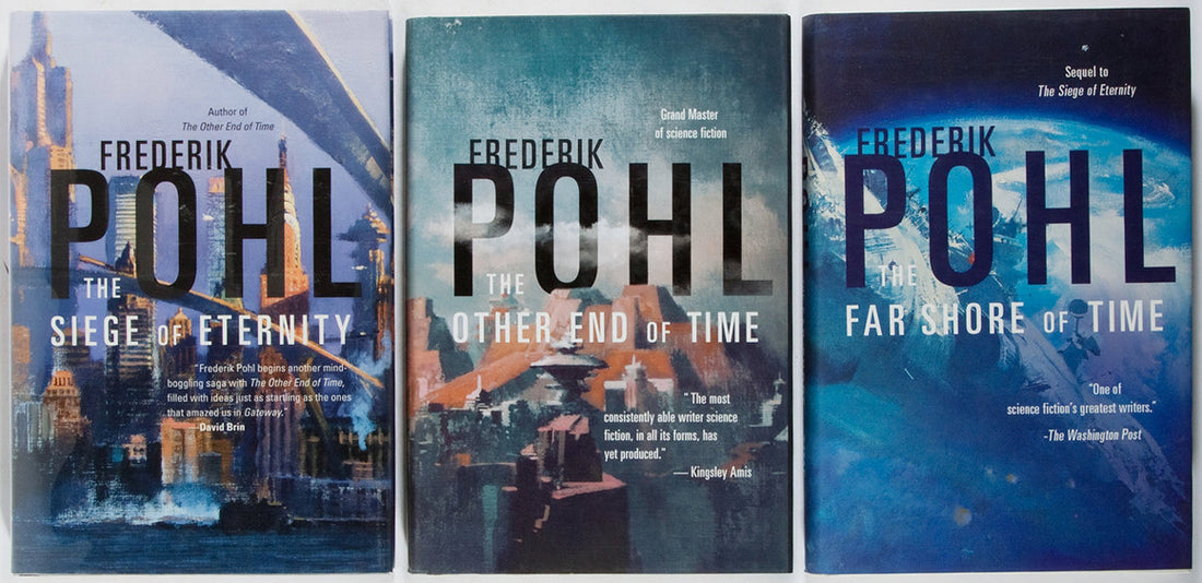
Rewind to around February 1996, a time when I was deeply immersed in crafting Tor Book covers, with a productive streak stretching from 1995 to late 1998.
In those days, my skills with Photoshop were hitting their stride. What might seem rudimentary now was revolutionary then. Merging typography seamlessly into an existing painting? That was cutting-edge stuff. Remember, it was just six years since Photoshop had been introduced to the world in 1990. By '96, the design landscape was still adjusting to the waves it made. One of my cherished memories is how I incorporated the mountain peaks to naturally complement the O and H, while the clouds from the original painting gently meandered around the author's name, adding depth and dynamism.
With a hunch, I decided to fashion the author's name in a unique "logotype" style, hoping it might pave the way for subsequent titles. I saw it as laying the groundwork for a branded series. And sure enough, my instincts hit the mark. Riding on this design, I got to design the covers for "The Siege of Eternity" and "The Far Shore of Time" in 1997, carrying forward that distinct flair.
No comments


0 comments